How a colored cup is actually made
Most colored paper cups start as white paperboard. The color you see is printed onto the outside as a solid flood, then your logo and any text are printed on top of it or knocked out of it so the white board shows through. That matters for your design in two ways. First, a knocked-out logo on a black or red cup reads as crisp white without needing white ink. Second, the inside of the cup and the rolled rim usually stay white, so a black cup has a thin white line at the lip and a white interior.
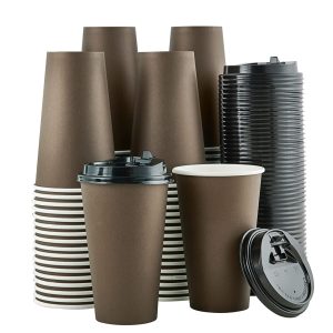
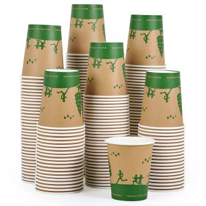
Brown cups are the exception people ask about most. A brown cup can be a printed brown flood on white board, or it can be natural kraft board with a brown surface of its own. They look different up close. Printed brown is even and smooth. Kraft has visible fibers and a slightly speckled, earthy texture. Decide which feel you want before you ask for a quote, because it changes the stock, not only the ink.
Choosing a cup color for your brand and menu
Color does a lot of quiet work at the counter. It tells customers what kind of place this is before they read a word. A few patterns that hold up in practice:
- Black suits espresso bars, cocktail-style mocktail menus and evening venues. It hides coffee drips well and makes metallic foil pop. Our matte black paper cups are the most requested option for that look.
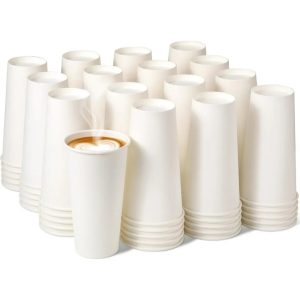
- White is the most flexible base. Full-color artwork, photography and detailed illustrations print most accurately on white, and white cups make any PMS logo color look true.
- Brown reads as natural, roasted and handmade. It fits coffee roasters, bakeries and farm stands.
- Green is the usual signal for plant-based menus, juice bars, matcha and tea shops.
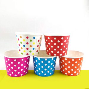
- Pink suits dessert bars, bubble tea, baby showers and boutique cafes.
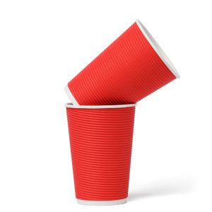
- Red grabs attention at stadium stands, holiday promotions and fast casual counters.
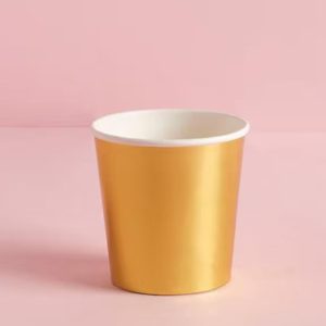
- Gold is for weddings, anniversaries, corporate galas and New Year parties, where the cup is part of the table setting.
Think about what goes in the cup too. A deep red cup with a hot cocoa menu looks warm and seasonal. The same red holding a green smoothie can look muddy in photos. If you sell drinks with strong colors of their own, a neutral cup often shows them off better.
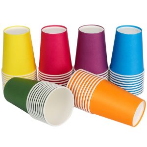
Colored cups side by side
| Cup color | Mood it gives | Works well with | Print tip |
|---|
| Black | Premium, modern, evening | Espresso, specialty coffee, bars and lounges | Use a white knockout or gold, silver or rose-gold foil logo |
| White | Clean, neutral, flexible | Any menu, full-color artwork | Best base for photos and exact PMS matches |
| Brown | Natural, roasted, rustic | Roasters, bakeries, farmers markets | Dark logos need a lighter outline to stay readable |
| Green | Fresh, plant-based | Juice, tea, matcha, salad bars | White or cream type reads best |
| Pink | Playful, sweet | Desserts, bubble tea, showers | Pairs well with a dark accent color for text |
| Red | Bold, energetic, festive | Stadiums, holiday menus, quick service | Keep text large; thin lines vibrate on red |
| Gold | Formal, celebratory | Weddings, galas, anniversaries | Foil gives a true metallic; printed gold looks flatter |
Matching your exact brand color
If your color is part of your trademark, print it as a PMS (Pantone) spot color rather than building it from CMYK. A spot color is mixed to a fixed recipe, so the cup matches your sign, your menu board and last month's order. CMYK is fine for full-color artwork and photos, but it can drift slightly on large solid areas, which is exactly what a colored cup is.
Send your Pantone reference if you have one. If you only have a hex code from your website, our design team can suggest the nearest PMS match, and a free sample lets you hold the cup next to your packaging before you commit. Finish changes how a color looks as well. Gloss makes colors look deeper and more saturated. Matte softens them and cuts glare under bright cafe lights, which is why black and dark green cups are often ordered matte. Spot UV on a matte cup adds a shiny logo you can feel.
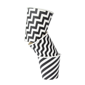
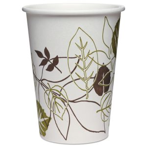
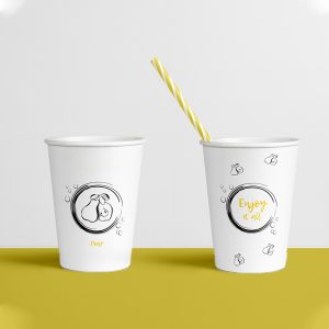
If a single color feels too plain and you want stripes, florals or illustrations, the special design paper cups collection starts from patterns instead of a solid flood.
Practical details for colored cups
Dark cups show scuffs more than light ones. If cups are stacked tight and shipped far, a matte or protective coating helps the color stay even. Light cups show coffee drips more, so a white cup at a busy drive-thru can look messy by the third refill. Lids are worth matching as well. A black cup with a white lid looks deliberate. A pink cup with a random clear lid looks unfinished. You can order matching paper coffee cup lids with the same run.
Hot drinks need a cup built for heat, and cold drinks sweat. Condensation on a cold cup won't wash off the print, but it does make a dark matte surface look patchy for a moment. For iced menus, gloss or a lighter color hides that better.
Ordering colored paper cups
- Pick your base color from the grid above and note any Pantone reference you need to match.
- Choose the size and wall type for your drink, hot or cold, single or double wall.
- Send your logo as a vector file if you have one. If not, our free design help will redraw it for print.
- Set the finish: gloss, matte, spot UV or foil. You can note the colors you want in the step-by-step order form on this page.
- Ask for a free sample if color accuracy is critical, then approve the proof.
- Production and delivery: 4–6 business days after approval, rush options available, and free shipping to the USA, Canada, the UK and Australia.
The minimum order is 100 cups, and volume discounts apply on larger runs. Many businesses keep one core color all year and add a second for a season or event. If you are still deciding on size or wall type before color, start with the full range of custom paper cups and come back here once the cup itself is settled.
Colored cups for events and one-off occasions
Event planners order colored cups because the cup sits on every table and in every photo. A wedding might use gold or white with the couple's initials. A baby shower picks pink or blue. A corporate launch matches the company color exactly. For formal tables, gold paper cups for weddings with foil names or dates look closer to tableware than a disposable cup. Because the minimum is 100 units, a single event order is realiztic, and the printed date makes the cups a small keepsake rather than something guests forget.


 Ice Cream Cone Sleeves
 Waffle Cone Sleeves
 Ice Cream Cone Wrappers
 Crepe Cone Packaging
 Sugar Cone Sleeves
 Custom Printed Coffee Sleeves
 Cake Cone Sleeves
 Cardboard Cone Sleeves
 Black Cone Sleeve
 Child Size Waffle Cone Sleeves
 Paper Cone Sleeves
 Small Cone Sleeves
 Eco-Friendly Cone Sleeves
 Aluminum Foil Cone Sleeves
 Two Color Cone Sleeves
 White Cone Sleeve
 Polka Cone Sleeves
 Abstract Cone Sleeves
 Rolled Cone Sleeves
 Chicken Cone Sleeves
 Custom Waffle Trays
 Ice Cream Cone Holder
 Paper Mache Cones
 Custom Bakery Trays
 Custom Cardboard Food Trays
 Custom Dessert Trays
 Custom Hot Dog Trays
 Ice Cream Cone Tray
 Custom Burger Trays
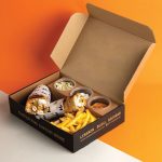 Custom Combo Meal Trays
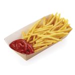 Custom Fries Trays
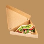 Custom Crepe Trays
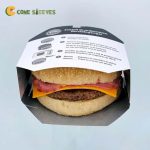 Burger Sleeves
 Custom Burrito Sleeves
 Custom Crepe Sleeves
 Custom Dessert Sleeves
 Custom Donut Sleeves
 Custom Tray And Sleeves
 Food Sleeves
 Chocolate Bar Sleeve Packaging
 Custom Bento Sleeves
 Custom Cupcake Sleeves
 Custom Die-Cut Sleeves
 Custom Hot Dog Sleeves
 Custom Cold Drink Sleeves