


 Ice Cream Cone Sleeves
 Waffle Cone Sleeves
 Ice Cream Cone Wrappers
 Crepe Cone Packaging
 Sugar Cone Sleeves
 Custom Printed Coffee Sleeves
 Cake Cone Sleeves
 Cardboard Cone Sleeves
 Black Cone Sleeve
 Child Size Waffle Cone Sleeves
 Paper Cone Sleeves
 Small Cone Sleeves
 Eco-Friendly Cone Sleeves
 Aluminum Foil Cone Sleeves
 White Cone Sleeve
 Polka Cone Sleeves
 Abstract Cone Sleeves
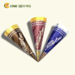 Rolled Cone Sleeves
 Chicken Cone Sleeves
 Custom Waffle Trays
 Ice Cream Cone Holder
 Paper Mache Cones
 Custom Bakery Trays
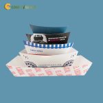 Custom Cardboard Food Trays
 Custom Dessert Trays
 Custom Hot Dog Trays
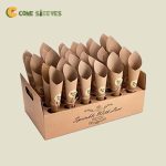 Ice Cream Cone Tray
 Custom Burger Trays
 Custom Combo Meal Trays
 Custom Fries Trays
 Custom Crepe Trays
 Burger Sleeves
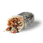 Custom Burrito Sleeves
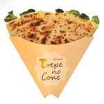 Custom Crepe Sleeves
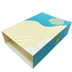 Custom Dessert Sleeves
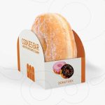 Custom Donut Sleeves
 Custom Tray And Sleeves
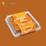 Food Sleeves
 Chocolate Bar Sleeve Packaging
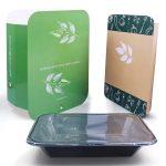 Custom Bento Sleeves
 Custom Cupcake Sleeves
 Custom Die-Cut Sleeves
 Custom Hot Dog Sleeves
 Custom Cold Drink Sleeves


What a Two-Color Cone Sleeve Is
A two-color cone sleeve is printed with exactly two inks, usually two Pantone (PMS) spot colors, on a white, kraft or colored stock. It is the format many of the best-known food brands use for everyday packaging, because two well-chosen colors are enough for a confident logo, a pattern and a line of text. Think of a navy and red sleeve for a boardwalk stand, pink and brown for a chocolate-dipped cone shop, or team colors at a ballpark.
Two-color printing isn't a cut-down version of full color. It is a design choice with its own strengths: colors that match exactly every time you reorder, clean edges with no dot pattern, and a bold, poster-like look that reads from across a crowded fair. People searching for cone sleeve design ideas often end up here because limits make a design stronger, not weaker.
When Two Colors Is the Right Call, and When It Isn't
Two colors suit you if your logo is already one or two flat colors, if you serve many locations and need the sleeve to look identical everywhere, or if your brand look is graphic rather than illustrated. Stadium stands, chains, schools and sports clubs fall into this group. It is less suitable if your brand relies on photos, gradients or a watercolor illustration; those need CMYK. For the full-color route, see our full-color printed ice cream cone sleeves.
A handy test: print your logo in grayscale. If it still makes sense as two tones, it will translate well to a two-color sleeve.
Getting More From Two Inks
Good two-color design uses a few printer's tricks to look richer than two colors.
- Tints. Each ink can print as a lighter screen, so a red at 100% and 30% gives you red and pink from one ink.
- Overprints. Where two transparent inks overlap they create a third shade, such as blue over yellow making green. Designers use this for shadows and accents.
- The paper as a color. On white stock, white becomes your third "color" for free. On kraft, the brown fiber does the same job.
- Contrast first. Pair a dark and a light ink. Two mid-tones of similar strength, such as red and green, look loud from far away but blur into each other close up, and they read poorly for color-blind customers.
- Leave a gap between colors. Where colors sit side by side, the designer allows a small overlap so tiny shifts during printing don't leave a white sliver. We handle this setup in prepress.
Color Pairs That Work on Cones
Here are combinations shop owners ask for often, with the kind of brand each one fits.
| Color pair | Stock | Feel | Typical business |
|---|---|---|---|
| Red and navy | White | Classic, Americana, summery | Boardwalk stands, July 4th events, diners |
| Pink and chocolate brown | White | Sweet, retro parlor | Scoop shops, candy and dessert bars |
| Black and gold-yellow | White | Bold, high visibility | Food trucks, stadium concessions |
| Forest green and cream | Kraft | Natural, farm-made | Creameries, farm stands, orchards |
| Teal and coral | White | Beachy, bright | Coastal kiosks, resort pool bars |
| Team primary and secondary colors | White | Spirit, loyalty | Ballparks, schools, youth leagues |
Kraft changes how inks look. Light inks fade into the brown, so on kraft choose one dark ink and one opaque-looking color, and expect both to come out a little warmer than on screen.
Material, Finish and Fit
Two-color sleeves print on paper, cardstock, kraft and paperboard, cut to whatever cone you serve: slim sugar cones, flat-bottomed cake cones, or wide waffle cones. A gloss coating deepens saturated inks such as red and navy; matte keeps pastel pairs soft and reduces glare in customer photos. A single foil element, such as a gold star or a silver outline around the logo, adds a premium touch without changing the two-ink setup. Embossing and spot UV are options too.
Because the colors are fixed PMS references, your sleeves will match your cups, napkins and signs printed elsewhere, as long as everyone uses the same Pantone numbers. Write them down once and share them with every supplier.
The stock under the inks matters as much as the inks. White gives the cleanest contrast and makes both colors read at full strength, which is why most two-color work starts there; our white cone sleeves with a printed logo show how far a single ink can go on that base. Kraft adds warmth and hides small drips, at the cost of some brightness. A tinted or colored stock is possible too, but it changes every color printed on it, so always check it on a physical sample first.
Ordering Two-Color Cone Sleeves
- Pick your two Pantone colors. If you only have a logo file, our free design team will suggest the closest matches.
- Choose the stock: white for the brightest colors, kraft for a natural look.
- Send the cone type and size, or a sample cone.
- Approve the flat proof and mockup; request a free sample if you want to see the inks on the real stock.
- We print within 4–6 business days of approval and ship free to the USA, Canada, the UK and Australia.
Orders begin at 100 units, and volume discounts make large summer runs cheaper per sleeve. For more inspiration on simple, long-lasting looks, read our guide to designing branded ice cream cone sleeves.

Sevi Adat –
Both CSR were very helpful with the orders I have placed. Will definitely use CS packaging for future service.
Michael R –
Cone Sleeves is great in terms of ease of use. They wanted to make sure everything was right…and it was! I paid to have it shipped sooner and it arrived within 48 hours. The product is great quality and just what I was looking for.
Joe I –
The customer service is the best I’ve ever had. Everyone is polite and listens carefully to requests. Products are good quality and get shipped quick. Keep doing what you’re doing!
Jerad C –
I think the customer service was excellent. I popped into the chat a few times about the status of my order and they were always polite. God bless you guys.