


 Ice Cream Cone Sleeves
 Waffle Cone Sleeves
 Ice Cream Cone Wrappers
 Crepe Cone Packaging
 Sugar Cone Sleeves
 Custom Printed Coffee Sleeves
 Cake Cone Sleeves
 Cardboard Cone Sleeves
 Black Cone Sleeve
 Child Size Waffle Cone Sleeves
 Paper Cone Sleeves
 Small Cone Sleeves
 Eco-Friendly Cone Sleeves
 Aluminum Foil Cone Sleeves
 Two Color Cone Sleeves
 White Cone Sleeve
 Polka Cone Sleeves
 Abstract Cone Sleeves
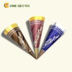 Rolled Cone Sleeves
 Chicken Cone Sleeves
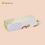 Custom Waffle Trays
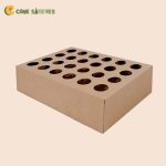 Ice Cream Cone Holder
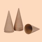 Paper Mache Cones
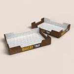 Custom Bakery Trays
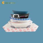 Custom Cardboard Food Trays
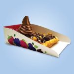 Custom Dessert Trays
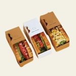 Custom Hot Dog Trays
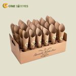 Ice Cream Cone Tray
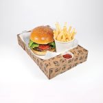 Custom Burger Trays
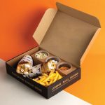 Custom Combo Meal Trays
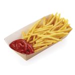 Custom Fries Trays
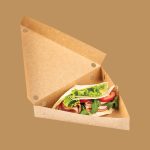 Custom Crepe Trays
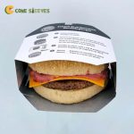 Burger Sleeves
 Custom Burrito Sleeves
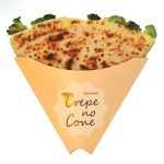 Custom Crepe Sleeves
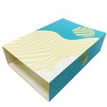 Custom Dessert Sleeves
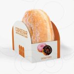 Custom Donut Sleeves
 Custom Tray And Sleeves
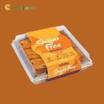 Food Sleeves
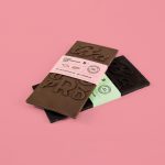 Chocolate Bar Sleeve Packaging
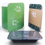 Custom Bento Sleeves
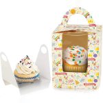 Custom Cupcake Sleeves
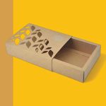 Custom Die-Cut Sleeves
 Custom Hot Dog Sleeves
 Custom Cold Drink Sleeves


Where Brown Cups Fit Best
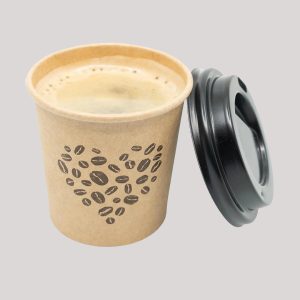
Brown paper cups send a quiet message before anyone reads the logo: this place is unfussy, honest and probably bakes its own bread. That is why you see them at farm stands, sourdough bakeries, roadside cider barns, health food stores and coffee carts parked at weekend markets. The color sits comfortably next to wood counters, chalkboard menus and burlap coffee sacks, so it rarely clashes with an existing shop interior.
People searching for brown disposable cups usually want one of two things. Some want the look of natural kraft fiber, with its visible flecks and slightly rough feel. Others want a smooth cup in a solid brown shade, such as chocolate, mocha or tan, printed onto white board. Both are available here, and the choice changes how your artwork looks, so it is worth deciding early.
| Brown option | Look and feel | Best match |
|---|---|---|
| Natural kraft board | Fibrous, matte, varies slightly batch to batch | Bakeries, farm brands, rustic cafes |
| Recycled kraft | Darker, more speckled texture | Brands that lead with reuse and low waste |
| Printed solid brown on white board | Even color, smooth surface, exact shade | Chocolate shops, mocha-themed menus, retail chains |
| Brown with a printed pattern | Wood grain, linen or burlap effects | Themed venues that want texture without kraft |
If the natural fiber look is the main reason you are here, our separate page on unbleached kraft paper cups for drinks goes deeper into that material.
Designing Artwork for a Brown Surface
Brown is a mid-tone background, which means it pulls every printed color darker. A bright orange will come out closer to rust. A light blue will look muddy. Yellow nearly vanishes. The colors that hold up best are black, deep green, dark red, navy and white. White ink in particular gives a sharp, chalky contrast that suits handwritten-style logos and simple line drawings of wheat, coffee beans or leaves.
On natural kraft, keep fine details to a minimum. The fiber texture breaks up hairline strokes and very small type, so set phone numbers and web addresses at a readable size and avoid thin script fonts below about a quarter inch tall. If your brand relies on one exact color, a PMS ink with a white base layer will get closer than CMYK alone. A printed solid brown cup, on the other hand, behaves almost like white board: colors stay cleaner because the base under the ink is white.
One trick bakeries like: print the logo once in white and repeat a small icon pattern in a slightly darker brown. It reads as texture from a distance and as branding up close.
Sizes, Small Cups and Handles
Small brown paper cups, in the 2 oz to 4 oz range, get used for coffee tastings, soup samples at a deli counter and free bites of granola at grocery demos. An 8 oz cup suits hot cider and drip coffee, while 12 oz and 16 oz carry lattes, chai and iced tea. Ripple and double-wall builds add grip and insulation for hot drinks; single-wall cups are fine for cold service or when a sleeve is used.
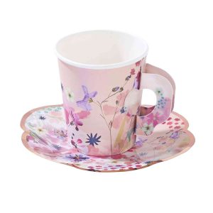
Some buyers are looking for a brown cup with a handle for tea service or hot chocolate at events. That is a different construction, and our paper cups with fold-out handles cover it with the same print options.
Handling Brown Cups at the Counter
- Kraft board can absorb moisture on the outside, so keep stacks off wet bar mats and away from the ice well.
- Brown lids look tidier on brown cups than bright white ones, though black lids work well too.
- Coffee drips are less obvious on brown than on white, which helps at busy self-serve stations.
- Natural kraft varies a little in tone from one run to the next. If you reorder, keep a cup from the last batch to compare.
- Store cartons flat and dry; humidity can make kraft rims feel soft.
Building a Brown Look Across the Whole Counter
A brown cup rarely works alone. The shops that get the most from it carry the same earthy tone into everything a customer touches: the bag a muffin goes home in, the napkin, the label on a bottle of cold brew. When those pieces match, the counter looks planned rather than pieced together from different suppliers.
Bakeries often pair brown cups with kraft pastry bags and a one-color stamp-style logo. Delis put soup in brown cups and sandwiches in brown wrap, so a lunch order looks like a set. Coffee roasters with a retail shelf print the same mark on cups and on bean bags, which helps customers find the beans after tasting the drink. If you sell food alongside drinks, our custom kraft food bags with logos are made in the same brown tones.
One practical point: brown is a forgiving color for staff. Smudges from a busy rush, a coffee splash or a damp fingerprint show far less than on white, so the cups still look presentable at the end of a long shift.
How a Brown Cup Order Works
Orders start at 100 cups and get cheaper per unit as quantities grow. Design help and a free sample are included, and shipping is free to the USA, Canada, UK and Australia.
- Decide between natural kraft and a printed solid brown, since it changes how inks behave.
- Choose sizes and a wall type: single, double or ripple.
- Send your logo, ideally as a vector file, plus any text or social handles you want on the cup.
- Check the proof, paying attention to how your colors are marked against the brown base.
- Approve, and your cups are produced in 4–6 business days. Rush production is available.
Our design team can mock up the same logo on kraft and on solid brown so you can see the difference before you pay for either.

Reviews
There are no reviews yet.